Data Visualization
Ever since reading Edward Tufte’s book Envisioning Information way back when I’ve been f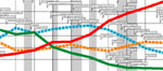 ascinated with how to best present complex information. So today I made a great find, a set of 12 charts by Karl Hartig. Each one can be downloaded as a PDF so you can get a really good look at it.
[via Guy Kawasaki]
About Shawn Callahan
Shawn, author of Putting Stories to Work, is one of the world's leading business storytelling consultants. He helps executive teams find and tell the story of their strategy. When he is not working on strategy communication, Shawn is helping leaders find and tell business stories to engage, to influence and to inspire. Shawn works with Global 1000 companies including Shell, IBM, SAP, Bayer, Microsoft & Danone. Connect with Shawn on: